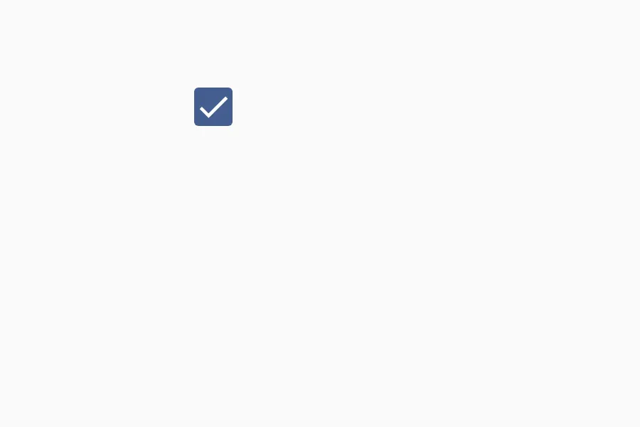
CheckBox
import { CheckBox, CheckState } from "material.slint";export component Example inherits Window { width: 200px; height: 100px; CheckBox { check-state: CheckState.checked; }}
A CheckBox is a control that allows users to select one or more options from a set. It can be in three states: unchecked, checked, or partially checked (when tristate is enabled).
Properties
Section titled “Properties”check-state
Section titled “check-state”enum CheckState (in-out) default: the first enum value
CheckState
This enum is used to define the state of a checkbox.
unchecked: The checkbox is unchecked.partially-checked: The checkbox is partially checked.checked: The checkbox is checked.
The current state of the checkbox. Can be unchecked, partially-checked, or checked.
CheckBox { check-state: CheckState.checked;}checked
Section titled “checked”bool (out) default: false
Whether the checkbox is checked (either fully or partially).
enabled
Section titled “enabled”bool default: true
Whether the checkbox is enabled and can be interacted with.
bool default: false
Whether the checkbox should display an error state.
tristate
Section titled “tristate”bool default: false
Whether the checkbox supports three states (unchecked, partially checked, checked).
Functions
Section titled “Functions”toggle()
Section titled “toggle()”Toggles the checkbox state. In tristate mode, cycles through unchecked → partially checked → checked → unchecked.
© 2025 SixtyFPS GmbH